Overall, I feel that this project went well even with the slight problematic start. Creating animated sequences with the iPad app Brushes was a new experience for me and I feel it worked well with the look I wanted to make, even thought it took a long time to get a working style for my idents. Once I had access to the iPads, I got a lot of work done, and I feel that my drawing I did for the City Of openings was my best one as I had more experience with the program at that point.
As I has having problems getting the right software, scheduling was a problem on this project. As there was a 2 week break in April, I had no access to college iPads and had to improvise by making makeshift idents using different software. Once I got back to college, however, I worked extra hours to get everything doe on time, especially when working with Brushes. There were also a few issues with exporting the finished drawings, as that could only be done at college as well. The limitations did make it more difficult to keep up with the deadlines, but eventually I got everything to work in the end.
Editing-wise, I feel that I did not use as many After Effects techniques as I could have, but as my idents are mainly focused around my own drawings, I did not need to use After Effects as much as other people on this project. Most of the After Effects techniques I used were masks, time stretches, and camera movement.
I feel that my finished work went over quite well with the client and that they liked the finished packages I created, and I hope they will be used in the future.
Wednesday, 22 May 2013
Finished City Of Openings
For my finished City Of intros, I have made many versions which have the different titles on them. They all look the same, except for the text at the end is changed. There are also two different versions of the openings, one is 15 seconds and the other is 5 seconds. The feedback given from Val was good, she thought the package was pretty much complete and the only alterations I made between Monday and today were that I changed the text placement to a more title safe area.
cityoffashion from Lucy Holman on Vimeo.
cityofart5sec from Lucy Holman on Vimeo.
cityoffashion from Lucy Holman on Vimeo.
cityofart5sec from Lucy Holman on Vimeo.
Sunday, 19 May 2013
Editing City Of Intros
I used similar editing styles to my idents, such as speeding up the footage to fit the 15 second time of the intro. Te main difference is that I have added a camera to make the opening look more interesting.
 The keyframes are set so that the start of the video is more zoomed in and pans down the picture, and eventually shows the full image.
At the end of the video, I had to create an extra part of the picture in Photoshop because I needed to add more sky for the text to fit in. After creating the new image, I made a motion path to created the panning effect of a camera going into the sky.


 |
| Start of the video, camera is zoomed in to the sky and South Downs |
 | ||
| Middle of the video, camera has moved down ad zoomed out |


Monday, 13 May 2013
Almost Finished Work Pitch
I have showed off my main sped up drawing to Val, and the feedback I got was generally positive. The main feedback given was that there was not enough room for the text on my image, so it was suggested that I make the camera pan up to the sky and that the text comes in on a blank sky background so it is easy to read. I should also get a full list of the City OF titles from Val so I can create multiple versions of the intro.
The other thing that came up was the fact that the intro at the moment was too long for the show, even though it was suggested for me to make it longer before. Because of this, I shall make 15 second and 5 second versions that could both be used in different parts of the show. The 5 second versions could started from when the picture is fully drawn and pan up to the sky to show the text.
Andrew suggested to add a camera angle to the ident to make it look more dynamic, so I shall look into adding a camera and who to pan it across the image.
Thursday, 9 May 2013
Drawing City Of Ident
The drawing for the City Of opening was done in the same way as the idents, however I have had to structure my drawing differently so it will be drawn in the way that was suggested in the feedback. I started by drawing in the sky and South Downds in the background, and building up the picture in parts so the landmarks that were more in the foreground would appear last. As there is a lack of layers available on Brushes, I could not have sketch layers either, which made it a bit more difficult to draw.
 |
| My finished artwork |
Wednesday, 1 May 2013
First Idea Pitch
To show off the concept of my opening, I used my original drawings from the channel idents, and put them all in one composition, whilst masking out the backgrounds of each of the drawings.

 For my feedback, I was suggested to make the idents longer, to the length of an actual TV show opening (15+ seconds). Although the brief says they wanted short openings, I could make a set of both, ona having the picture drawn in, and one that's shorter without it. I was also told that the picture should start from the background, and then have the pieces of he city come in rather than the sky coming in last. The skyscrapers in the back do not fit in either, and I was suggested to scrap them in favour of having the South Downs in the background instead.


Tuesday, 30 April 2013
City Of Ideas
Earlier in the month I was assigned with creating a show package for City Of, and now that I have finished my idents, I can now focus on ideas for the show.
From the information given from Val, this is what has been requested by her.
"CITY OF - I can see this working well with the Latest TV ident style brands. They too are very quick appearing at the beginning of the show only. 3-5 seconds in length. Although we may want a ‘What’s on tomorrow’s City of ....’ So far the City of’s that we have are the following: City of Community, City of Music, City of Art, City of Film, City of Ecology, City of Health, City of Fashion, City of Food. Although these programmes may be largely factual programming, there may be exceptions to this rule - such as City of Comedy or City of Accentrics."
The main information here is that she would like the show intro to be similar to the ident style for the channel. With that in mind, I will be using a similar idea to the one I have created, which is the animating a drawing idea. As it is called City Of, I should encorperate more landmarks of Brighton into my drawing, and make it a compilation of all the landmarks into one big picture. As she wants the idents to only be a few seconds long, the sped up drawing should be much quicker than it usually is.
Lower Thirds
I have made a lower third for the station that could be used to show what would be on next etc. It features the main landmarks of Brighton to fit with the theme of my idents and is red to fit in with the colour of the branding for the channel.


Monday, 29 April 2013
Shorter Idents
As well as making 10 second idents, I have made each of them into 5 and 1 second ident versions. These were simple enough to do, and I used the same techniques as I did with my long idents. I used Time Stretch to make the video go even faster, and moved the fade out points on the audio to the 5 second point. I got rid of the audio completely on the 1 second idents as I felt that a 1 second ident would be too short to need audio.


Sunday, 28 April 2013
Finished Idents
After all of the problems finding the right way to record my idents, I have finally finished my set of 4 idents. They are themed around Brighton, and include scenes of the Brighton Eye, Pavillion, Pier and Churchill Square.
finalidentwheel from Lucy Holman on Vimeo.
finalidentpavillion from Lucy Holman on Vimeo.
finalidentpier from Lucy Holman on Vimeo.
finalidentshop from Lucy Holman on Vimeo.
finalidentwheel from Lucy Holman on Vimeo.
finalidentpavillion from Lucy Holman on Vimeo.
finalidentpier from Lucy Holman on Vimeo.
finalidentshop from Lucy Holman on Vimeo.
Friday, 26 April 2013
Editing my Idents
Most of the work I have done in After Effects has been speeding up clips and using masks to animate the text into the idents, but I have used some other techniques to improve the video.
On some of my drawing videos, parts of the sketch would flash up quickly as I was using them as a guide in the drawing. As the video was sped up, it would be possible to cut out the sketch without there being much difference in the drawing itself.
To do this, I selected my video at the point where it needed to be cut and used the "Split Layer" tool.

 After editing out the parts that needed to be cut, my timeline would look like this when the video was split into different layers.
The mask I used for all of the text in my idents has a mask path which makes it so the takes comes in from one side, giving the effect of it being drawn in.
 There is also a feather on the mask so it looks like the text comes in less abruptly.
On some of my drawing videos, parts of the sketch would flash up quickly as I was using them as a guide in the drawing. As the video was sped up, it would be possible to cut out the sketch without there being much difference in the drawing itself.
To do this, I selected my video at the point where it needed to be cut and used the "Split Layer" tool.
I then proceeded to delete parts of the video that had the sketch layer on, so it would flow better.

The mask I used for all of the text in my idents has a mask path which makes it so the takes comes in from one side, giving the effect of it being drawn in.

Tuesday, 23 April 2013
Using Brushes Ipad App
Today I went into college to do some extra work on my idents. I have started to use Brushes for my channel idents, and I will have to redraw all of my old pictures onto the iPad. How the program works is that it records each of your brush strokes, which get shown on the playback. I can draw the image and then speed up the playback to show the progression from sketch to fully coloured drawing. I then email the video to Andrew and the video gets processed on the Brushes program for Mac. I have managed to draw four pictures, and I will begin editing these tomorrow for them to be ready to be sent to Val on Monday.
 | |
| One of my drawings done in Brushes |
Monday, 22 April 2013
Work In Progress Pitch
Today we showed our work to Val, and after having problems with being able to animate my idents, I unfortunately did not have much to show Val this time. I showed my animations that I made in Corel Painter, but I would like to avoid using Painter as I do not think the effects is as strong as it would be if I used Brushes instead.
Overall, the feedback I had gotten for my drawings was good but I need to use brushes to animate it instead of Corel Painter.
Overall, the feedback I had gotten for my drawings was good but I need to use brushes to animate it instead of Corel Painter.
Saturday, 20 April 2013
Problems With Animating
As I have not had access to the college iPads over half term, I have not been able to experiment with using the app called Brushes to draw my artwork like Andrew suggested. I have, for the time being, been trying out an alternative, which was to use Corel Painter's autopaint feature, and screen record the drawing being painted in. There are problems with this, however, as my screen recording size is not the same as 1080p and would have to be upscaled, so I should probably wait until I can use Brushes to animate my idents.
Wednesday, 27 March 2013
FIrst Idea Pitch
After showing my ideas for my idents to Val and getting other ideas from my class, I feel that this is going to be a promising idea. Val seemed to like the art style I have used for my mockups, so I will try to replicated that in my final idents. However, I am still unsure how I am going to make the pictures look like that are going to be drawn in. I have a concept that I like, but I lack the proper execution as of yet.
Sunday, 24 March 2013
Mockup Ident
So far I have mocked up a couple of idents. I have drawn pictures of the Brighton Eye and the Pavillion, and I have then animated it in After Effects to see what it would look like being drawn in. FOr my final ident I hope to find a way to record myself drawing it for the best effect. The length of the ident is 10 seconds.
 |
| Animation starts with the sky fading in |
 |
| Each part of the picture comes in layer by layer |
 |
| The final picture |
Wednesday, 13 March 2013
Change In Style
After talking about my idea with Chris, I have decided to change my art style to focus more on Brighton landmarks rather than making it based around people so the idents look more local and recognisable as Brighton, as I have drawn a couple of sketches in my book of these places and got better feedback from these drawings than the art style I was originally going to use. I will look at photos of Brighton and draw them in a similar style to the artists I have researched.


Monday, 11 March 2013
Art Research
I have looked at 2 artists in particular, as I like their art style and the way they use colour in their pictures.
The first artist I have looked at is Christopher Nielsen. I like the way his art is drawn, especially how his character designs look unique and how the colours and strokes are used throughout his art.


The second artist I have looked at is Ben Mounsley. His art style bears a resemblance to Christopher's in the way that he uses bold colours and less outlines on his pictures.


In my art, I hope to use a similar colouring style to these pictures, by using less outlines on my pictures and the same sort of colours that are used in these pieces.
The first artist I have looked at is Christopher Nielsen. I like the way his art is drawn, especially how his character designs look unique and how the colours and strokes are used throughout his art.
The second artist I have looked at is Ben Mounsley. His art style bears a resemblance to Christopher's in the way that he uses bold colours and less outlines on his pictures.
In my art, I hope to use a similar colouring style to these pictures, by using less outlines on my pictures and the same sort of colours that are used in these pieces.
Wednesday, 6 March 2013
Ident Research
After the talk with Val, I have looked at some existing idents for channels, to look at their length and timing.
This BBC Three Ident is 21 seconds long, which is rather long for a channel ident. The talkover part of the ident is around 10 seconds long, which is around the time the brief states that the ident should go on for.
When watching BBC Three on TV, one of their other idents went on for around 20 seconds, so the usual time for idents on BBC Three is 20 seconds long.
Really's idents go on for around 20 to 30 seconds, as they are fully animated scenes that are similar to that of comics. The talkover time seems to be around the same as the BBC Three ident, lasting around 10 to 15 seconds.
Channel 4 has a veriety of length for their idents, varying from 30 seconds to 5 seconds. Again, voiceovers last around 10 seconds. For our project, we will have to make various ident lengths, so it is helpful to see what Channel 4 have done with their footage to make various ident lengths. Many of the short idents are just sped up or parts of longer idents, which would a good idea to do with our own idents.
When watching BBC Three on TV, one of their other idents went on for around 20 seconds, so the usual time for idents on BBC Three is 20 seconds long.
Tuesday, 5 March 2013
Meeting Val
After getting our brief for this project, we had a meeting with some of the people that work at Latest TV. From this meeting, we got some extra information on the channel, and what would be needed for the idents and what shows would be on the channel.
As the channel is local, the main target audience for the channel would be the locals of Brighton. The content on the channel will have various audiences, so the idents for the channel should be varied to suit most audiences. The channel will run for 24 hours and as well as having original show,s there will also be bought in content. The channel will be commited to local news and shows 2 hours a day. The main font of Latest TV is Verdana, and the logo colour is red so it would be best to stick with these as they are the channel's current branding.
The shows the are being thought of at the moment are Brighton Lights, The Vote, City Of, Deep and Meaningless, and Shuvit (Name of show may be changed).
Monday, 4 March 2013
Brief
You have been commissioned to deliver on screen branding for Latest TV for both the station as a whole and for individual programmes.
You will design and create a station ident package identifying Latest TV, Channel 8, or both, consisting of at least the following:-
one ident long enough for a continuity voice over, in the region of 10 seconds, which may resolve with a loop or static graphic to allow for longer announcements
one channel branding ident of between 3 and 5 seconds
one short ident of around 1 second for punctuation, such as between ad breaks and shows
one sting from the bottom or side of the screen
Your ident and sting package needs to keep to a consistent and coherent concept and look and feel, while allowing for enough variation around your theme to keep it engaging and interesting. You should aspire to create a range of versions much more extensive than the minimum requirements of the brief.
You will be producing your ident package individually following the guidelines given by the client.
You have also been allocated a programme to work on. Most of the programmes require title sequences, end credit sequences, lower thirds designs and in show graphics, especially to act as punctuation between items, though the specific needs of the shows will vary and you need to follow the guidance from the client. Some of the shows have been allocated to individuals, some to pairs. If you are in pair, you may choose to collaborate or to work individually (and therefore competitively). Even if you are competing, you must work together on your communication with the client and share information and resources that the client gives you.
You need to create your TV Idents and Programme Packages at 1080p.
Wednesday, 27 February 2013
Evaluation
Overall, I did not like this project that much. I think that choosing Yahoo as my client brief was a mistake, as I have found it difficult to completely redesign their site to make it more user friendly, and making it look better aesthetics-wise.
In my opinion, I don't really like the design I came up with. Although I liked the improvements I made with Yahoo's own icons, I felt that my final site design was missing something.With previous website designing briefs, I could use my drawins as part of the layout. However, with this design being more simplistic, I found it hard to use my design strengths in this particular project.
My time management could have been better as well, as I did the majority of the designing in February when I could have started it a bit earlier. I should have also started my PDF a bit earlier as well so I could have made an even better design for it. The demonstration video was also a bit rushed as I had focus more on design work at the end of the project, rather than how I was going to make the video.
Although I feel that I have not done as well as I could have on this project, I have learned a few things about designing minimalistic sites, and I hope to improve on my design skills in the next project.
Final Designs
These are my final designs for the site, and the mobile site. The changes have mainly been done to the main site, where I have made the icon bar optional.


Monday, 25 February 2013
Crit
I think that my crit this time could have gone a bit better. I did like the design of my website or the quality of the video that much, and I got a lot of points that I could improve on.
The website was said to be a good attempt at redesigning a cluttered site, but still had too much going on. To address this, I am thinking about making the icon bar optional and will be hidden away by default. I should also make the content boxes less text heavy.
The video needs some more work done to it, such as having short animations to know what you are clicking on, and just better examples of customisation. I will change this by animating more parts, such as the size and position of widgets.
My PDF design wasn't criticised too much either, mainly just the amount of text on each page. I shall make the text bigger and cut it down so the pages look better.
Saturday, 23 February 2013
Animations
Here are some screentshots from my animation, which demonstrates the customisation of my website.
 The first part of the video shows a couple of screenshots of the site with different customisation options.
 This part shows the moving of icons from the toolbar to the storage bar.
 This part was filmed on Photoshop, and it shows the changing of colours on the site. I did it by screen recording myself changing the hue of the image in Photoshop.


Friday, 22 February 2013
Working on PDF
I've started working on my PDF, and so far I have design a couple of pages. I don't really like my design at the moment, but hopefully with feedback at crit I will get some optinions on the design.
I have planned to have around 10 pages, talking about how I came up with the design, and pages focusing on the different aspects for the site, such as layout, customisation, icons, etc.


I have planned to have around 10 pages, talking about how I came up with the design, and pages focusing on the different aspects for the site, such as layout, customisation, icons, etc.
Thursday, 7 February 2013
Pitch
Overall, I think that my pitch went fairly well. The response I got was generally positive, although there were some issues with the amount of customisation that I showed. In my screenshots, all I have show so far is changing of colour and icons on the site, which is what customisable sites can already do. I will need to think of more ways to make this site more unique. One thing that was suggested would be to make parts of the site bigger or smaller dependant on usage of that particular widget. It would also be easier to show the features of the site in a video, so I will spend some time thinking up ideas for the video.
The pitch has been helpful in deciding where to go with my final idea, and what to do in the upcoming weeks.
The pitch has been helpful in deciding where to go with my final idea, and what to do in the upcoming weeks.
Tuesday, 5 February 2013
Customisation
I have designed several types of customisation options and interfaces for them. These options will help make a site that the user wants.
 This is the customise panel for the toolbar. They can be dragged and dropped onto the main toolbar, and dragged into the place you want them to be. The icons can be taken off the toolbar by placing them into the bottom bar.
 This is the section to change the site's colours. It is done by simply clicking the box and clicking the colour on the colour bar.
 This option is similar to the colour picker, except you can choose images for sections of the site rather than colours. Pictures can be uploaded to an URL can be used. There is also the option for tiling the image.
 Here are more options for changing the icons. The size and shape of the icons can be changed here.
The layout options were originally all on one page, but it looked far too cramped and busy, which is the opposite of what I want the site to be. Instead, I have separated the options to make the pages look cleaner.


The layout options were originally all on one page, but it looked far too cramped and busy, which is the opposite of what I want the site to be. Instead, I have separated the options to make the pages look cleaner.
Thursday, 31 January 2013
Mobile Site Layout
I have started to design a mobile site to go along with my main website.

Wednesday, 30 January 2013
More Design Work
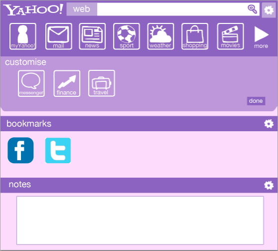
I've been spending most of my project time thinking up new designs for the Yahoo homepage, especially when coming up with the customisable homepage.
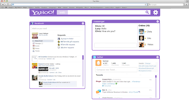
 This is the default homepage layout. The blue bar under the toolbar is a video advertisement for the new My Yahoo, which I have made in order to give My Yahoo more exposure. Again, the content for the site has been simplified to take up less space.
 This is an example of a customised page. The toolbar shows customisation of icons. They can be dragged and dropped. It also shows some of the widgets that can be used, such as a bookmark bar and a place to leave notes.

Monday, 21 January 2013
My Yahoo
Whilst looking around Yahoo's site, I cam across 'My Yahoo'.
 This part of Yahoo was actually hard to find on the homepage, as it was hidden under the section of the site that shows more of Yahoo's pages. It was not shown on the homepage at all.
 I feel that this part o Yahoo has potential, but needs to be redesigned a lot. Because of this, I should focus on making My Yahoo more noticed.

Friday, 18 January 2013
Refining Designs
After sketching out ideas, I have made a mockup of the toolbar to see what it would look like digitally.
 Although I am liking the idea of the toolbar, it still doesn't feel completely finished. I shall go back and tweak the design a bit more, and possibly experiment with different colours.

Thursday, 17 January 2013
First Designs
I have been thinking about site layout ideas in my sketchbook, and I have came up with a vague idea of what I want my site to look like.
 I have been thinking about changing the logo, as the current one looks a bit outdated. This is a design for the default homepage, before being logged in for customisation features. The layout of the main stie has been changed a bit so there are not too many things cluttering the homepage.

More Research
I have looked at other popular homepages that were considered competition by Yahoo. The similarities between these two sites is that their homepage looks simple, with very little text.

 Google's homepage is even more simple than Facebook. Google's homepage has remained unchanged since the site began, and its simplicity has its success. As soon as people open their browser, they will most likely want to search for something. Google being a page with just a search function gives the user exactly what they want.

Facebook's homepage when you are not logged in is meant to encourage you to sign up to see content. It is easy to follow, as the way to sign up is shown clearly on the page. There is little imagery used on the page apart from the world map to show the connectivity of people of Facebook.

Wednesday, 16 January 2013
Class Discussion
The idea for my initial idea went over well. The idea was to make a fully customisable homepage, which has things like bookmarks etc. to take you to other websites. The customisation idea has many options for design, and I think I will stick with this design as it answers the brief and is very open in terms for how to design it.
Tuesday, 15 January 2013
Very First Ideas
So far, I have looked around Yahoo's current website, picking out its strengths and faults. One of the most glaring flaws I can find is that it is very cluttered and not very user friendly, and does not target the audience they have set on the brief, which is 13-18 year olds.
My first idea is to make a fully customisable webpage, where the user has control of the content. The site will have to be stripped down to look more minimal, and would have to feature things that would cater to the target audience.
Back when I has a teenager, I liked to use Bebo and one of the main features of that site was that you could customise the skin and content on your profile. This is sort of what I would like to do with Yahoo's site, and give the user their own unique experience with the site.
Meeting YCN
As part of this project, we got a chance to visit YCN up in London. During the visit, we were told about what YCN does, and more information about the competition itself, as well as having the change to ask questions ourselves.
Most of the talk was about YCN's own projects, and what they have done recently. This included a video for Arsenal fans on a newsletter. One of the most important things I learned on the trip to YCN was about the pdf I will have to submit at the end of the project. As the pdf is going to feature our work, it must be of high quality, and have a well thought out design.
Most of the talk was about YCN's own projects, and what they have done recently. This included a video for Arsenal fans on a newsletter. One of the most important things I learned on the trip to YCN was about the pdf I will have to submit at the end of the project. As the pdf is going to feature our work, it must be of high quality, and have a well thought out design.
Monday, 14 January 2013
YCN Brief - Yahoo!
Objectives
In numbers: To increase the percent of Yahoo! users to set Yahoo! as their
homepage.
In perception: I’m inspired to makeYahoo! the place I start my internet journey every day.
The Creative Challenge
Yahoo! is the original .com start-up, the first internet site that made sense at scale of the sprawling mass that is the internet.The core element of this success is the Yahoo! homepage. In a single page it is able to capture the most important things you need in your daily internet life - to communicate, to find out, to explore. Google and Facebook are now more popular homepages - so there is now a need to inspire our users, particularly those new to the internet, about to set an email address for the first time, to again setYahoo! as their homepage.
A dry list of benefits is not going to persuade them - but beautiful, engaging, fun, digital creative, illustrating those benefits just might.This work should be able to appear onYahoo! and across tablet, mobile and desktop as a minimum - but the brief is open to exploring new ways (particularly digital) to reach our target audience. These may be ways that everyone’s been ignoring for years, are unfashionable,
or simply bonkers - but our target audience set a high bar for their attention daily and we need to meet it.
Target Audience
13-18 year olds.
They are getting a smartphone for the first time, they have ready access to a tablet - even if its through school.They love and use Facebook,Twitter and Instagram in that order (and need an email address to use them).They’re already adept at filtering the multiple messages that they’ve been sent since they were born, chopping, making their own, shifting between different personas online and offline, with their friends and family. Authenticity is key.
Creative Requirements
A digital creative campaign:
-
Do ensure that your idea works across all of the multiple creative canvases at adspecs.yahoo.co.uk
-
Please think beyond these formats into what you think will engage this audience on any screen - or where a screen could go.Proposition
Everyday indispensable fun.
Supporting Comments
Wherever you are, and whichever screen - our homepage gives you every day something more entertaining and inspiring:
Supporting Comments
Wherever you are, and whichever screen - our homepage gives you every day something more entertaining and inspiring:
-
The most interesting thing that’s happening today (for you).
-
Whether you should wear a coat or put the sun-tan lotion on.
-
Search the web for what you’re looking for.
-
Connect with your friends - more thoughtful with mail, more instant with
messenger, more collective with groups. In Conclusion
Please put simple classic engagement over heavy, tech intensive work.Think about place - where would it be unexpected, interesting and relevant for your work to be displayed?Think about your everyday habits in the real world - how that can be translated digitally
In the project pack you will find brief guidelines on how to use theYahoo! logos to ensure your work has the best chance to be able to go live.
Deliverables, Artwork and Additional Information
For guidance on how to submit your work, please adhere to the main deliverables information in the Student Awards section of theYCN website.
Any additional supporting information referenced in the brief can be found in the supporting project pack on theYCN website – www.ycn.org
Subscribe to:
Comments (Atom)