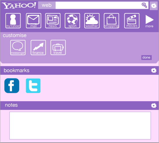
I have started to design a mobile site to go along with my main website.
The toolbar at the top looks similar to the website, but there are some changes in layout and functionality. By pressing the arrow below the icons, it brings down a menu full of other icons that the user has set up in their customisation options. The way the site info is laid out is also different from the site, to make it look more like a mobile app (As well as the search bar).
Thursday, 31 January 2013
Wednesday, 30 January 2013
More Design Work
I've been spending most of my project time thinking up new designs for the Yahoo homepage, especially when coming up with the customisable homepage.
This is the default homepage layout. The blue bar under the toolbar is a video advertisement for the new My Yahoo, which I have made in order to give My Yahoo more exposure. Again, the content for the site has been simplified to take up less space.
This is an example of a customised page. The toolbar shows customisation of icons. They can be dragged and dropped. It also shows some of the widgets that can be used, such as a bookmark bar and a place to leave notes.
This is the default homepage layout. The blue bar under the toolbar is a video advertisement for the new My Yahoo, which I have made in order to give My Yahoo more exposure. Again, the content for the site has been simplified to take up less space.
This is an example of a customised page. The toolbar shows customisation of icons. They can be dragged and dropped. It also shows some of the widgets that can be used, such as a bookmark bar and a place to leave notes.
Monday, 21 January 2013
My Yahoo
Whilst looking around Yahoo's site, I cam across 'My Yahoo'.
This part of Yahoo was actually hard to find on the homepage, as it was hidden under the section of the site that shows more of Yahoo's pages. It was not shown on the homepage at all.
I feel that this part o Yahoo has potential, but needs to be redesigned a lot. Because of this, I should focus on making My Yahoo more noticed.
This part of Yahoo was actually hard to find on the homepage, as it was hidden under the section of the site that shows more of Yahoo's pages. It was not shown on the homepage at all.
I feel that this part o Yahoo has potential, but needs to be redesigned a lot. Because of this, I should focus on making My Yahoo more noticed.
Friday, 18 January 2013
Refining Designs
After sketching out ideas, I have made a mockup of the toolbar to see what it would look like digitally.
Although I am liking the idea of the toolbar, it still doesn't feel completely finished. I shall go back and tweak the design a bit more, and possibly experiment with different colours.
Thursday, 17 January 2013
First Designs
I have been thinking about site layout ideas in my sketchbook, and I have came up with a vague idea of what I want my site to look like.
I have been thinking about changing the logo, as the current one looks a bit outdated. This is a design for the default homepage, before being logged in for customisation features. The layout of the main stie has been changed a bit so there are not too many things cluttering the homepage.
More Research
I have looked at other popular homepages that were considered competition by Yahoo. The similarities between these two sites is that their homepage looks simple, with very little text.
Facebook's homepage when you are not logged in is meant to encourage you to sign up to see content. It is easy to follow, as the way to sign up is shown clearly on the page. There is little imagery used on the page apart from the world map to show the connectivity of people of Facebook.
Google's homepage is even more simple than Facebook. Google's homepage has remained unchanged since the site began, and its simplicity has its success. As soon as people open their browser, they will most likely want to search for something. Google being a page with just a search function gives the user exactly what they want.
Wednesday, 16 January 2013
Class Discussion
The idea for my initial idea went over well. The idea was to make a fully customisable homepage, which has things like bookmarks etc. to take you to other websites. The customisation idea has many options for design, and I think I will stick with this design as it answers the brief and is very open in terms for how to design it.
Subscribe to:
Posts (Atom)