Overall, I did not like this project that much. I think that choosing Yahoo as my client brief was a mistake, as I have found it difficult to completely redesign their site to make it more user friendly, and making it look better aesthetics-wise.
In my opinion, I don't really like the design I came up with. Although I liked the improvements I made with Yahoo's own icons, I felt that my final site design was missing something.With previous website designing briefs, I could use my drawins as part of the layout. However, with this design being more simplistic, I found it hard to use my design strengths in this particular project.
My time management could have been better as well, as I did the majority of the designing in February when I could have started it a bit earlier. I should have also started my PDF a bit earlier as well so I could have made an even better design for it. The demonstration video was also a bit rushed as I had focus more on design work at the end of the project, rather than how I was going to make the video.
Although I feel that I have not done as well as I could have on this project, I have learned a few things about designing minimalistic sites, and I hope to improve on my design skills in the next project.
Wednesday, 27 February 2013
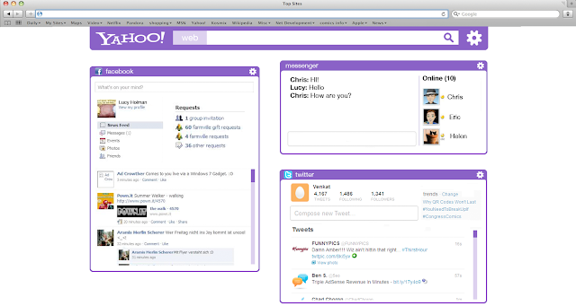
Final Designs
These are my final designs for the site, and the mobile site. The changes have mainly been done to the main site, where I have made the icon bar optional.


Monday, 25 February 2013
Crit
I think that my crit this time could have gone a bit better. I did like the design of my website or the quality of the video that much, and I got a lot of points that I could improve on.
The website was said to be a good attempt at redesigning a cluttered site, but still had too much going on. To address this, I am thinking about making the icon bar optional and will be hidden away by default. I should also make the content boxes less text heavy.
The video needs some more work done to it, such as having short animations to know what you are clicking on, and just better examples of customisation. I will change this by animating more parts, such as the size and position of widgets.
My PDF design wasn't criticised too much either, mainly just the amount of text on each page. I shall make the text bigger and cut it down so the pages look better.
Saturday, 23 February 2013
Animations
Here are some screentshots from my animation, which demonstrates the customisation of my website.
 The first part of the video shows a couple of screenshots of the site with different customisation options.
 This part shows the moving of icons from the toolbar to the storage bar.
 This part was filmed on Photoshop, and it shows the changing of colours on the site. I did it by screen recording myself changing the hue of the image in Photoshop.


Friday, 22 February 2013
Working on PDF
I've started working on my PDF, and so far I have design a couple of pages. I don't really like my design at the moment, but hopefully with feedback at crit I will get some optinions on the design.
I have planned to have around 10 pages, talking about how I came up with the design, and pages focusing on the different aspects for the site, such as layout, customisation, icons, etc.


I have planned to have around 10 pages, talking about how I came up with the design, and pages focusing on the different aspects for the site, such as layout, customisation, icons, etc.
Thursday, 7 February 2013
Pitch
Overall, I think that my pitch went fairly well. The response I got was generally positive, although there were some issues with the amount of customisation that I showed. In my screenshots, all I have show so far is changing of colour and icons on the site, which is what customisable sites can already do. I will need to think of more ways to make this site more unique. One thing that was suggested would be to make parts of the site bigger or smaller dependant on usage of that particular widget. It would also be easier to show the features of the site in a video, so I will spend some time thinking up ideas for the video.
The pitch has been helpful in deciding where to go with my final idea, and what to do in the upcoming weeks.
The pitch has been helpful in deciding where to go with my final idea, and what to do in the upcoming weeks.
Tuesday, 5 February 2013
Customisation
I have designed several types of customisation options and interfaces for them. These options will help make a site that the user wants.
 This is the customise panel for the toolbar. They can be dragged and dropped onto the main toolbar, and dragged into the place you want them to be. The icons can be taken off the toolbar by placing them into the bottom bar.
 This is the section to change the site's colours. It is done by simply clicking the box and clicking the colour on the colour bar.
 This option is similar to the colour picker, except you can choose images for sections of the site rather than colours. Pictures can be uploaded to an URL can be used. There is also the option for tiling the image.
 Here are more options for changing the icons. The size and shape of the icons can be changed here.
The layout options were originally all on one page, but it looked far too cramped and busy, which is the opposite of what I want the site to be. Instead, I have separated the options to make the pages look cleaner.


The layout options were originally all on one page, but it looked far too cramped and busy, which is the opposite of what I want the site to be. Instead, I have separated the options to make the pages look cleaner.
Subscribe to:
Comments (Atom)